
Responsive Web Design Solutions: How to Optimize for All Devices

Have you ever opened a site on your phone, looked at it for two seconds, and closed it because it appeared faulty? Most people do this every day without realising it. We constantly jump between phones, tablets, and laptops now. If a site doesn’t adjust quickly or feels clumsy on even one screen, it loses the user right there. That’s traffic lost, money wasted, and trust broken—just because the layout didn’t hold up. Around 6.04 billion people are online in 2025, close to 73% of the world’s population, according to Statista. If your site cannot handle this mix of screens, you lose visitors you already paid to attract.
This is where responsive web design solutions matter. They allow one website to adjust neatly to different screen sizes without feeling tight on a phone or stretched on a wide monitor. The pages remain fast, readable, and user-friendly from anywhere if they are done properly. There is no need for separate versions of mobile and desktop.
This guide explains responsive design in simple terms and also shows how it affects SEO and sales. Additionally, there are steps that one can follow to make the site convenient for use on any device. No heavy tech talk. Only actual instances, frequently made errors, and corrections that you can use with your team or your web agency.
TL;DR
- One website should work on all screen sizes—no separate mobile or desktop versions.
- Responsive design improves SEO, saves costs, and keeps users happy.
- Done right, it handles layout, images, and screen behavior smoothly.
- Start with mobile-first planning and flexible layouts.
- Watch for common issues like slow loading and poor testing.
Key Points
- Responsive web design means a single site that adjusts automatically to phones, tablets, and desktops.
- User experience improves when layouts are clean, buttons are tappable, and pages stay fast across devices.
- SEO benefits come from using one mobile-friendly URL that search engines can index easily.
- Cost savings show up long-term since you manage and update only one codebase.
- Fluid grids, media queries, and scalable content form the foundation of responsive web behavior across devices.
- Mobile-first design ensures a clean user experience on small screens before scaling up for larger layouts.
- The choice between responsive, adaptive, and fluid design depends on layout behavior and how breakpoints are handled.
- Testing on real devices is essential to catch layout bugs that don’t show up in browser previews.
- Common mistakes include desktop-first planning, oversized media files, and poor accessibility for users with different needs.
- Working with an experienced web design team helps you manage breakpoints, image handling, and system upgrades over time.
What Is Responsive Web Design?
Responsive web design lets one website fit all screen sizes without breaking. The same page adjusts itself to look right on a phone, tablet, or desktop. Nothing looks too tiny or out of place. This keeps things simple—you don’t need separate sites for each device.
It works through flexible layouts, scalable images, and CSS rules that react to screen width. Today, this approach is a core part of professional web solutions services, not an optional upgrade. You can see how this fits into broader business-focused website development planning used by growing companies.
For a web solutions company, this reduces long-term maintenance load, helps reach more users, and keeps the site working smoothly on every screen.
Pros of Responsive Web Design
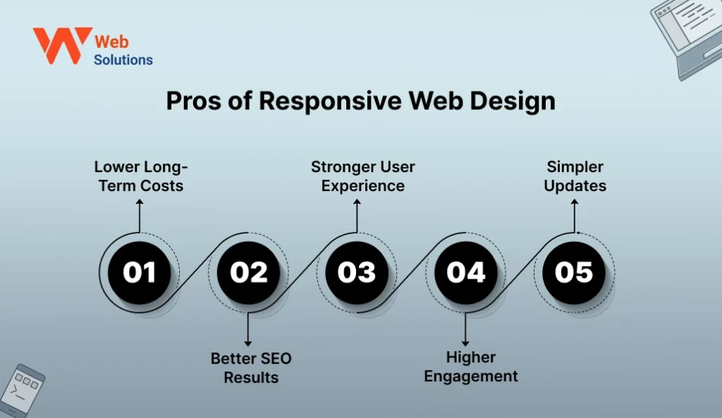
Responsive sites make life easier for both users and businesses. The biggest gain is reach. Your site works on every screen without building separate versions.
1. Lower Long-Term Costs
You build and manage only one website instead of separate mobile and desktop versions. This cuts design, development, and maintenance expenses over time. Updates, fixes, and content changes happen once, not in multiple places.
2. Better SEO Results
Search engines prefer a single, mobile-friendly website over split versions. A responsive site avoids duplicate content and helps link value on one URL. This improves crawlability and supports stronger rankings.
3. Stronger User Experience
Visitors get clear layouts, readable text, and simple navigation on every screen. Buttons stay easy to tap, and nothing feels tight on small phones. This keeps people relaxed on the site instead of annoyed.
4. Higher Engagement
When a site feels easy to use, people hang around and click more. They do not rush away because nothing feels stuck, slow, or broken. This steady engagement often leads to better conversions.
5. Simpler Updates
You edit content, design, or features in one place only. The changes reflect across all devices instantly. It saves the time of your team and decreases inconsistency risks.
Cons of Responsive Web Design
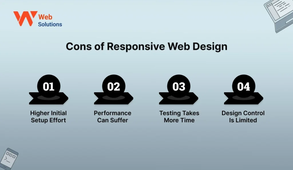
Responsive design is not always the best solution. It requires correct organization, continuous testing, and speed adjustment if you want it to operate properly on all screens. Some projects feel heavier at the start because flexible layouts take more effort to set up. Knowing these limits early saves you from shocks later.
1. Higher Initial Setup Effort
A responsive site needs clear thinking from day one. Layouts, breakpoints, and flexible sections take extra time to set right in the beginning. This can make the early phase slower than a basic fixed-width site.
2. Performance Can Suffer
Large images, heavy scripts, and flexible layouts can drag down speed if they are not handled well. Mobile users notice this lag much faster than desktop users. Extra effort is needed to keep the site fast on all devices.
3. Testing Takes More Time
Testing your site for different screen sizes, browsers, and devices is necessary. A layout that works well on one phone might fail on another without giving you any notice. This increases QA time before final launch.
4. Design Control Is Limited
Some complex desktop designs do not scale well to very small screens. Designers often need to simplify layouts for mobiles. This can feel like a compromise for brands that want heavy visuals everywhere.
The Importance of Responsive Website Design Solutions
Today, most users meet your brand first on a mobile screen. If your layout breaks, loads slow, or feels hard to use, they leave without a second thought. Strong web design solutions make sure your site looks steady and works well on every device. For any growing web solutions company, responsive design is no longer a choice, it is a basic need.
1. Save Costs
One responsive site does the job of both mobile and desktop versions. This lowers design work, build effort, and long-term upkeep. With the right planning support from a trusted web solutions partner, you avoid repeat rebuilds and quiet costs that surface later.
2. Increase SEO Rankings
Search engines prefer mobile-friendly sites that run on one clean URL. A responsive setup avoids duplicate pages and makes crawling easier for bots. This combined with intelligent digital growth planning results in improved visibility and stable organic traffic over time.
3. Optimize User Experience (UX)
Users demand good scrolling, readable text, and effortless tapping on whichever screen they employ. A responsive layout shifts spacing, buttons, and content flow on its own. With the right web solutions services in place, this ease keeps users around longer and builds steady trust.
Difference Between Responsive, Adaptive, and Fluid Design
These three methods may seem similar, but they work in different ways. Here are the details below:
Responsive design uses flexible grids and CSS that shift based on screen size. The layout changes smoothly as the screen gets bigger or smaller, without sudden jumps.
Adaptive design works on preset breakpoints. The site checks the device and loads a layout made for that screen size. This gives you tighter design control, but it also means more planning and more upkeep later.
Fluid design is the most flexible of all. Every element scales in percentages, not fixed units. It stretches across any width in a smooth way, but it can look odd if not controlled well. This is where strong web design solutions matter to keep the layout from drifting out of shape.
| Feature | Responsive Design | Adaptive Design | Fluid Design |
| Layout behavior | Layout adjusts smoothly to all screen sizes | Different fixed layouts for set screen sizes | Layout stretches freely across all widths |
| Breakpoints | Uses flexible breakpoints with CSS | Uses predefined device breakpoints | No fixed breakpoints |
| Device support | Works on all devices automatically | Targets specific devices | Works on all devices but not always neatly |
| Maintenance | Easy to manage with one layout | Higher effort due to multiple layouts | Easy to manage but tricky to fine-tune |
| User experience | Consistent across all screens | Optimized per device | Can feel uneven on extreme screen sizes |
| Best use case | Modern business websites | Apps with strict layout control | Simple content-driven sites |
Core Principles of Responsive Design
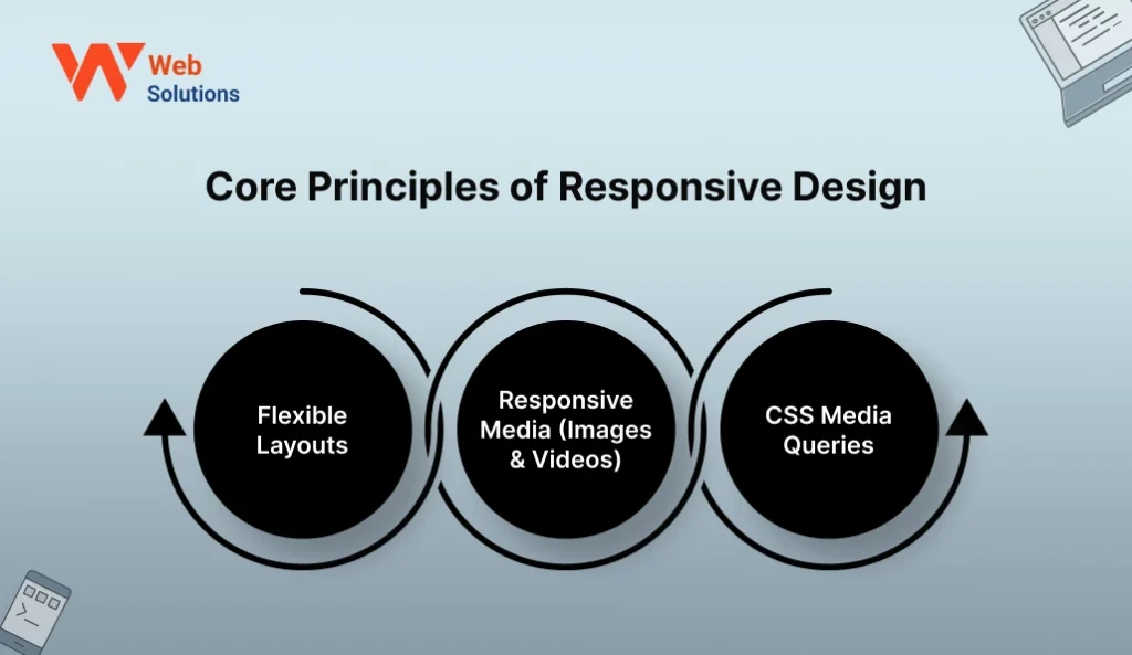
Responsive design works best when the rules are planned from the start. These rules decide how the layout stretches, how images resize, and how the site behaves on different screen widths.. When these foundations are weak, even strong web design solutions fail on smaller devices. Getting these basics right keeps the site stable on every screen.
1. Flexible Layouts
Flexible layouts rely on relative units instead of fixed widths. Columns grow or shrink with the screen, not a stiff pixel count. They keep the content readable on small phones and large desktops without disturbing the balance of the layout.
2. Responsive Media (Images & Videos)
Images and videos must resize without losing clarity or pushing layouts out of place. This is done using fluid sizing and smart scaling rules. When media is properly optimized, pages stay fast and visually balanced on every device.
3. CSS Media Queries
Media queries let the design change at specific screen widths. They control font size, spacing, layout flow, and visibility of elements. This is where the real “responsiveness” happens behind the scenes.
How to Make a Responsive Website to Optimize User Experience
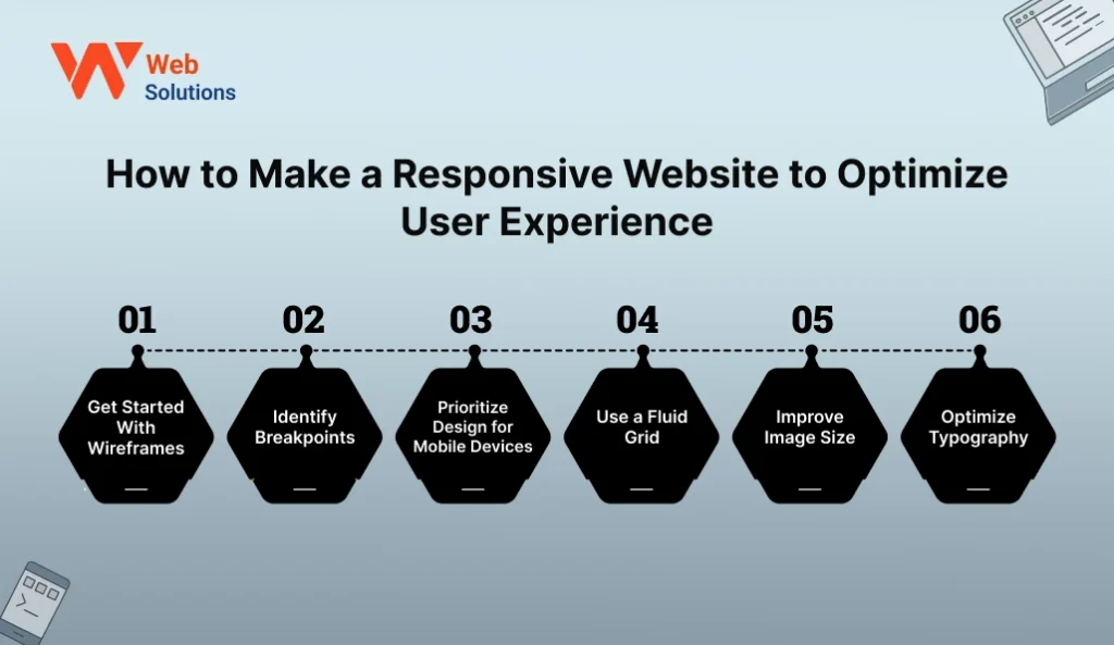
Building a site that feels right on every screen is not about random tweaks. It follows a clear process from planning to testing. When web design solutions are applied step by step, the experience stays smooth for users and simple for your team to maintain.
1. Get Started With Wireframes
Wireframes map out your layout before design or code begins. You see how content will stack on mobile and spread on desktop. This early planning avoids clutter and costly redesigns later.
2. Identify Breakpoints
Breakpoints are the screen widths where your layout changes. These are set based on real device sizes, not guesswork. Clear breakpoints keep your design from stretching awkwardly on tablets and small phones.
3. Prioritize Design for Mobile Devices
Begin with the smallest screen. A mobile-first approach forces you to cut noise and keep only what matters. Once the site works well on a phone, expanding it for bigger screens becomes simpler and cleaner.
4. Use a Fluid Grid
A fluid grid uses percentages instead of fixed pixel widths. This lets sections expand and contract naturally with screen size. It keeps spacing balanced across all devices without manual resizing.
5. Improve Image Size
Big images drag down page speed, more so on mobile networks. Use responsive image formats and proper compression to keep pages light and quick to load. This keeps visuals sharp while protecting page speed.
6. Optimize Typography
Text must stay readable on every screen. Font size, line height, and spacing must shift with screen width. Clear typography eases the eyes and helps people stay on the page longer.
Challenges and Solutions in Responsive Design
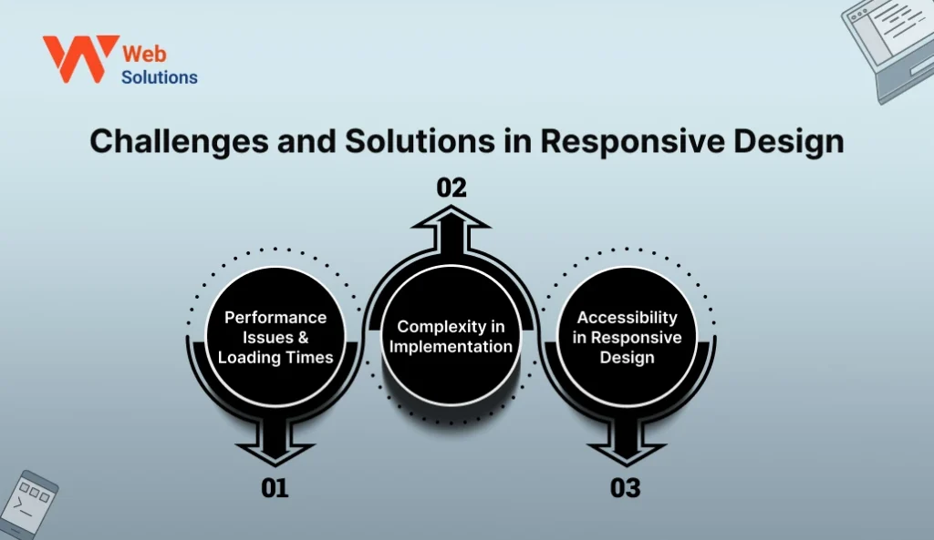
Responsive layouts fix many issues, but they also come with their own set of challenges. Most problems appear during speed tuning, layout control, and accessibility checks. With the right web design solutions in place early, these do not turn into costly fixes later.
1. Performance Issues & Loading Times
Responsive websites frequently use the same files on all devices, which can make things slower on phones. Big pictures, heavy scripts, and styles that are not used are gradually accumulating and pulling the user experience down. The fix lies in smart compression, lazy loading, and careful asset control with help from experts who save time and money through web solutions consulting.
2. Complexity in Implementation
Designing for many screen sizes means more layout rules, extra breakpoints, and detailed testing. A small change that looks fine on one screen can quietly break another. That’s why clear planning and a solid structure help keep things in control as your site scales.
3. Accessibility in Responsive Design
Elements that resize well may still fail for users with visual or motor challenges. Small buttons, low contrast text, and shifting layouts can create barriers. A skilled team guided by the real role of a web solutions consultant can test for screen readers, contrast, and touch targets from the start.
Conclusion
Good design today is not about how a site looks on one screen. It is about how it feels on every screen. The site feeling on every screen is what it is about, not only its look. Your site should feel smooth on any screen — phone, tablet, or desktop. That’s the job of good web design. It keeps things readable, fast, and simple. A responsive layout also saves you from rebuilding everything every time a new device drops. Your content adjusts. Your layout holds up. Your user stays happy. For an expanding company, this consistent experience gradually instills the users with confidence and hence, keeps the traffic coming back. If you are making a change, it would be better to do it step by step rather than taking a big leap at once. You can always connect with our web team for a quick responsive review and map your next move with a clear head.
FAQs
1. What are the common mistakes in responsive web design?
The biggest one? Designing only for desktop first and patching mobile at the last minute. That’s where many sites go wrong. Another problem is loading large images that look great on laptops but slow down phones badly. And testing only on a couple of screens. A small layout tweak that looks fine on one device can quietly mess up the experience on others.
2. What are some examples of well-executed responsive websites?
You’ll find good responsive websites across news sites, ecommerce stores, and SaaS dashboards. These brands don’t boast about their design—they just make it work. Menus don’t glitch, images resize neatly, and layouts flow cleanly whether you open them on a phone or a large monitor. It all feels natural and nothing looks broken.
3. Who is responsible for designing a responsive website?
It’s always a team effort. Designers handle how the layout adjusts. Developers write the code that responds to screen size. Testers check how everything works across different devices. Often, a full web design company manages this entire process to make sure no part slips through the cracks.
4. Is responsive web design good for SEO?
Yes, it supports SEO in a practical way. Google prefers mobile-friendly sites over separate desktop and mobile versions. This avoids duplicate pages and makes it easier for search engines to read your content. A properly built responsive website usually holds stronger rankings across devices.
5. How long does it take to build a responsive website?
It depends. A basic business site might take 2–4 weeks. A bigger site with more pages or features takes longer. If the content is ready and decisions are clear, timelines stay smooth. But poor planning and late-stage changes? That’s where delays creep in.